Project Description
Client: Los Angeles County Department of Parks and Recreation, Regional Park and Open Space District
Category: Brand Identity
Related Project: Regional Park and Open Space District Headquarters
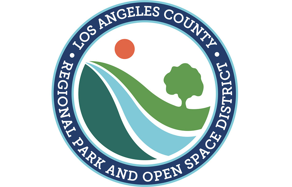
RPOSD’s branding redesign had to work well with the logo of its parent organization, the Los Angeles County Department of Parks and Recreation, while also being visually set apart. It was important to the core team that the design provide a clear message about its vision and purpose while also reflecting LA County’s variety of parks and open spaces. Because RPOSD often deals directly with the public, the logo also needed to resonate on a visceral level while maintaining the trustworthiness of a government entity. The Think Farm helped the team drill down to the essence of the organization: “providing funds for parks projects to bring trustworthy tranquility, adventure, and newness” to the people of Los Angeles County. Rather than literally depict all the values and objectives that stakeholders identified as key message points, The Think Farm pursued a design that had a clear, relatable theme to evoke an emotional connection.
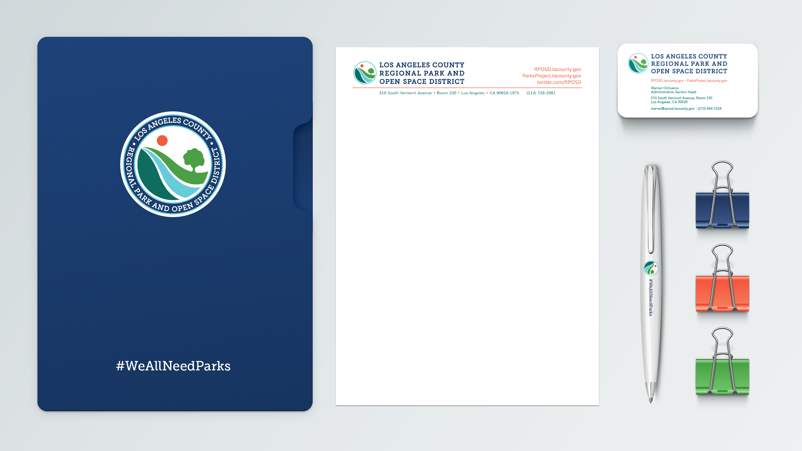
RPOSD’s new logo uses a font that feels friendly and slightly nostalgic, and the imagery depicts various aspects of nature with a vanishing point that speaks to a sense of openness and adventure. The colors are bold yet harmonious and fresh. The seal iteration of the logo is a nod to official government seals while the more informal secondary version allows for flexibility of use. The circular icon is easily recognizable and is often used on its own.

