Project Description


Client: 40 Days + 40 Writes
Category: Brand Identity
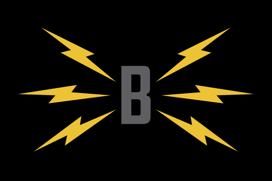
40 Days + 40 Writes is a writing workout program: participants are given a daily writing prompt for 40 days and given 24 hours to complete each assignment. Because the name is a play on the Biblical notion of “40 days and 40 nights,” and the program is about daily practice, I chose yellow-orange to signify day (“40 Days”) and midnight blue to signify night (“40 Writes”). The font is bold and minimalist, as the program is a no-nonsense, low-frill approach to the discipline of writing.


