Project Description


Original Exploring New Horizons campus logos (above) reimagined below:




Client: Exploring New Horizons Outdoor Schools
Category: Brand Identity
Additional Services: Web Design, Social Media Campaigns, Copyediting
Related Project: Exploring New Horizons Collateral
Exploring New Horizons is a unique outdoor education program that serves over 8,000 kindergarten through eight grade students from the San Francisco Bay Area and the Central Coast. Due to the fact that its three campuses largely operate independent of each other, Exploring New Horizons suffered from substantial inconsistencies in its visual identity. This resulted in a lack of organizational cohesion and brand power.
Its brand redesign needed to (1) conceptualize a new logo based on the thematic spirit of the original, (2) create visual unity among all three campuses, and (3) retain each campus’ uniqueness in order to preserve existing campus-specific brand awareness.
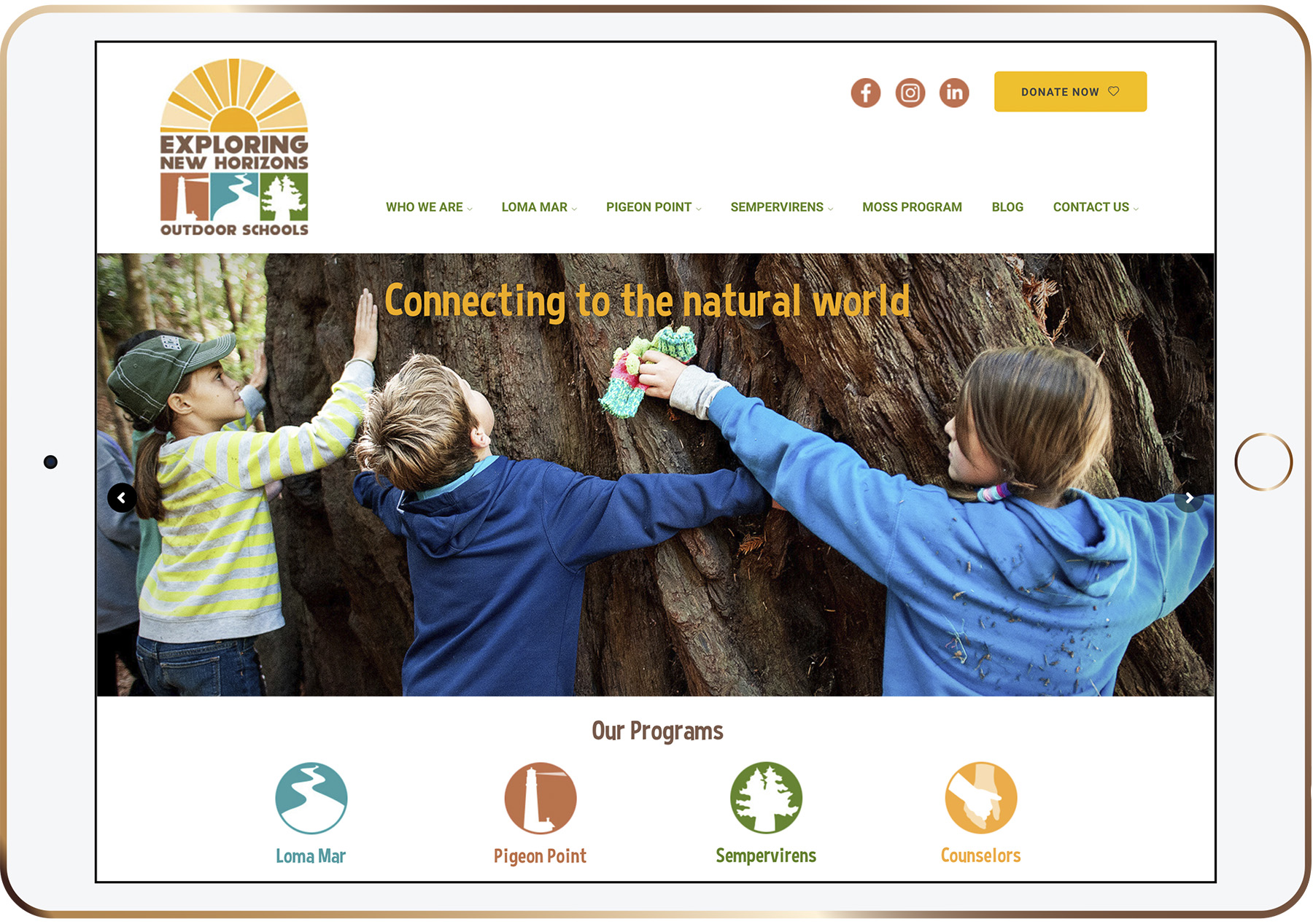
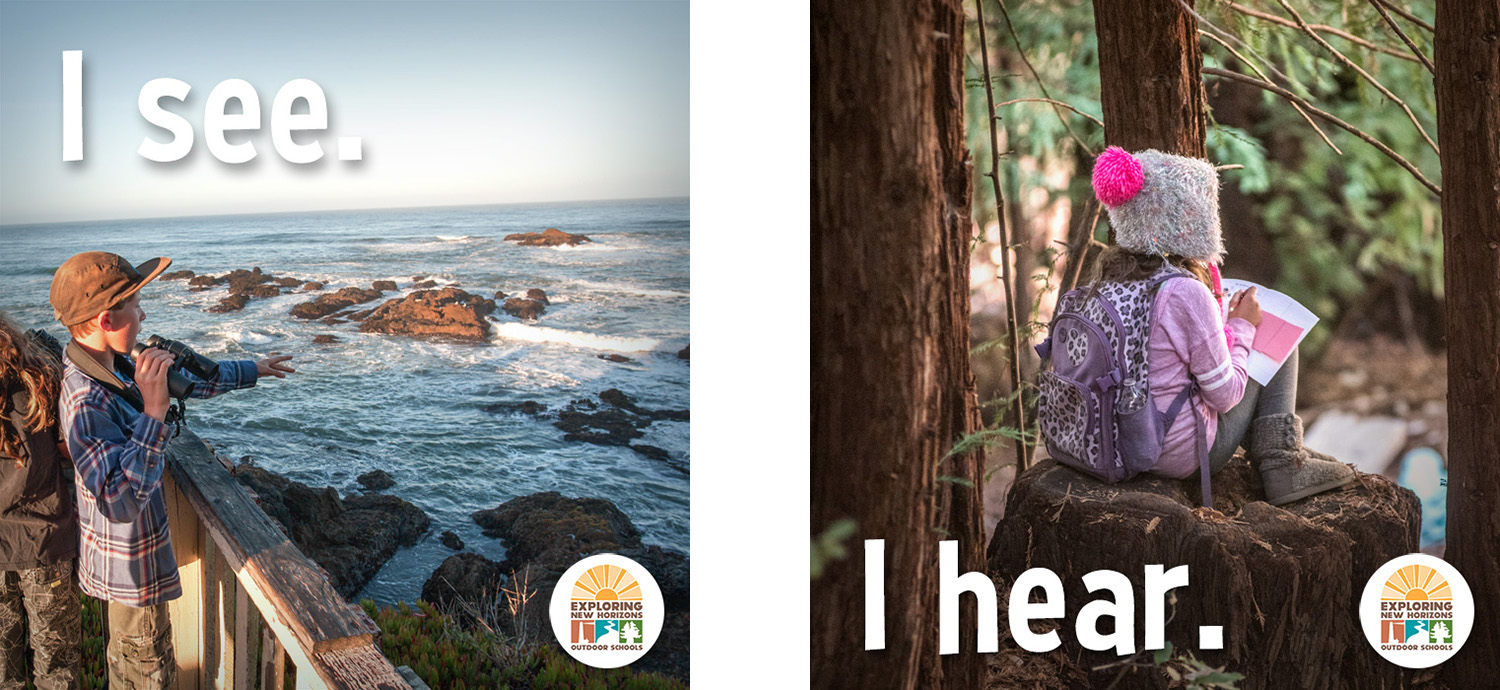
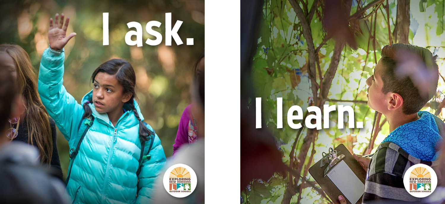
Because many students participating in the program come from urban areas where there is little access to nature, The Think Farm reimagined the sunburst element from the original logo as seen through a window, new horizons as of yet unreached and waiting to be explored. Playful yet bold fonts and warm, bright colors were chosen. The main logo incorporated signature landmarks from each campus as silhouettes while individual campus logos featured their landmark and their location name. The Think Farm has continued to work with Exploring New Horizons on its website, social media campaigns, and donor appeals.
Photographs provided by Exploring New Horizons.


